 |

PrimeFaces SelectCheckboxMenuIt is used to choose multiple items displayed in an overlay. We can create it by using <p:selectCheckboxMenu> component. It displays options in an overlay. It provides attribute that are tabled below. SelectCheckboxMenu Attributes
Ajax Behavior EventsSelectCeckboxMenu provides an Ajax event in addition to common dom events like change, selectCheckboxMenu.
ExampleHere, in the following example, we are implementing <p:selectCheckboxMenu> component. This example contains the following files. JSF File// calendar.xhtml ManagedBean// CheckboxMenu.java This JSF application produces the following output. Output: 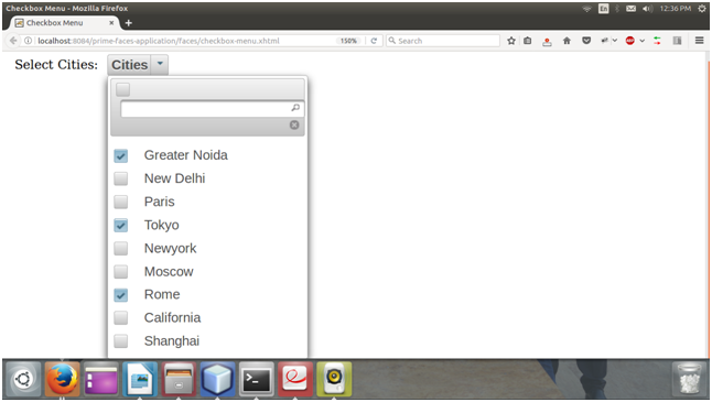
We can see that it allows us to select multiple items from the menu.
Next TopicPrimeFaces Editor
|
 For Videos Join Our Youtube Channel: Join Now
Feedback
- Send your Feedback to [email protected]
Help Others, Please Share


Like/Subscribe us for latest updates or newsletter 


